1. Introduction: Canva vs Figma
In the evolving realm of digital design, the Canva vs Figma debate has gained significant traction. Both tools have risen to prominence, championing unique features and catering to different user bases. As designers, marketers, and businesses grapple with the decision of which platform to adopt, this comparison aims to offer an in-depth analysis, shedding light on their respective strengths and limitations. Whether you’re a design novice or a seasoned professional, understanding the nuances of Canva and Figma can guide you to an informed choice, ensuring your design aspirations are met with the right tools.
If you’re also keen on exploring other tool comparisons, particularly in the email marketing domain, you might find our post on MailerLite vs ActiveCampaign enlightening.
Table of Contents
2. Pricing: Canva vs Figma
In the vast realm of online design tools, choosing the right platform often boils down to a balance between functionality and cost. When discussing Canva vs Figma, it’s crucial to look beyond the mere price tag and consider the value offered at each price point. For casual designers or those focused on social media content, Canva might be more appealing, especially with its free or Pro versions. Conversely, design professionals handling complex projects or collaborating in team environments might lean towards Figma’s Professional or Organization tiers. Let’s break down the specifics of their pricing models:
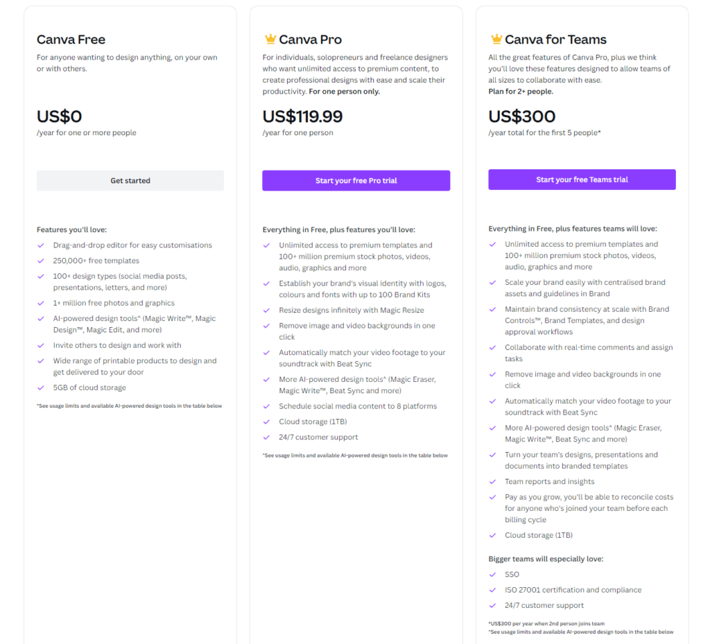
Canva:
- Free Tier: Canva’s comprehensive free version is ideal for beginners and even some professionals, offering access to thousands of free templates, diverse design types, and limited storage.
- Canva Pro: This subscription-based premium tier caters to businesses and professionals seeking advanced features such as brand kits, magic resize, and premium stock images.
- Canva for Teams: For larger businesses or organizations, this plan encompasses everything in Pro, augmented by advanced collaboration tools, unlimited storage, and dedicated support.
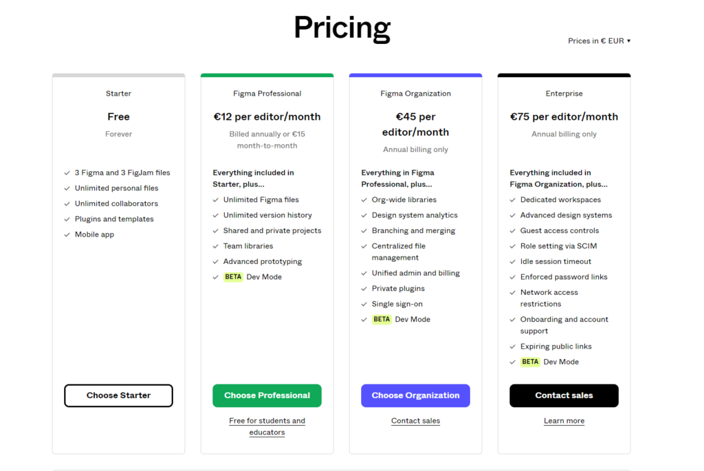
Figma:
- Free Tier: Figma’s free starter plan caters to individual users, granting access to core design and prototyping features, though with restrictions on the number of active projects.
- Professional: Targeted at designers and teams needing more collaborative capabilities, this subscription-based tier provides unlimited projects, custom team libraries, and advanced sharing options.
- Organization: Suited for companies, this Figma tier offers all Professional features, supplemented by organizational-wide design systems, enhanced security features, and user analytics.
- Enterprise:
In summing up, while price is undeniably a significant consideration in the Canva vs Figma discourse, it’s equally important to match the costs against individual design needs and objectives. Both platforms present a spectrum of options tailored to different budgets and needs, ensuring there’s an optimal fit for every designer.
3. Ease of Use: Canva vs Figma
User experience in design platforms is pivotal, especially when efficiency and swift project turnovers are at stake. When comparing Canva vs Figma on ease of use, it becomes essential to discern which platform is more intuitive for varying user expertise levels. Let’s evaluate the user-friendliness of each:
Canva:
- Intuitive Interface: Canva’s layout is straightforward, with clear icons, drag-and-drop functionalities, and an organized workspace.
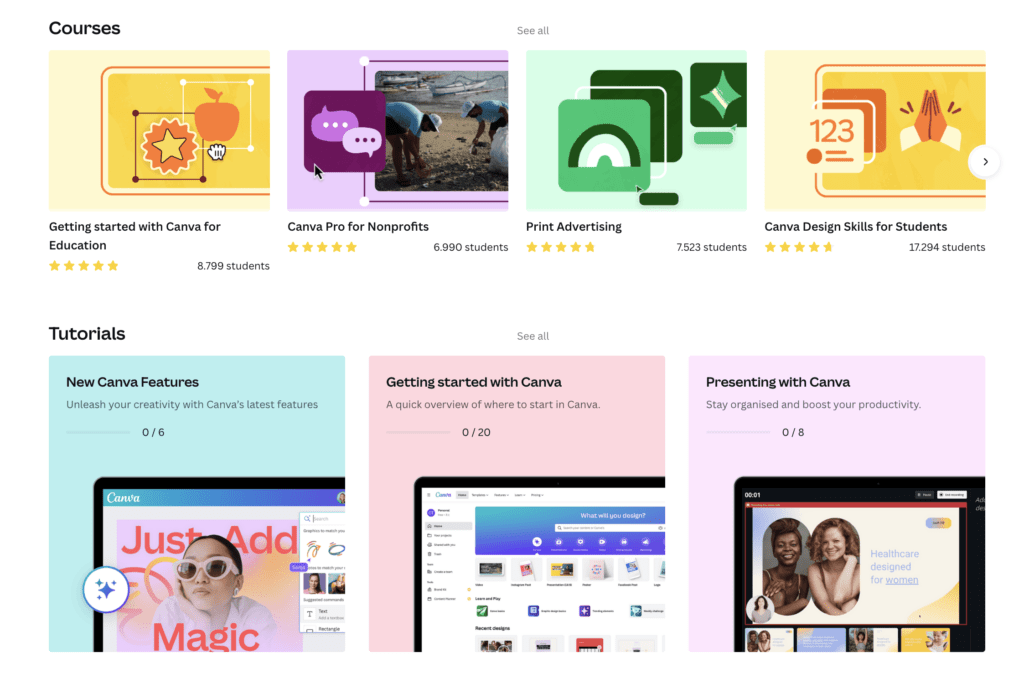
- Guided Tutorials: New users can quickly familiarize themselves with Canva through its range of tutorials and design lessons, helping them get started with minimal friction.
- Pre-designed Elements: From templates to graphical elements, Canva offers a plethora of ready-to-use assets, minimizing design effort for beginners.
- Contextual Tooltips: Hovering over tools and features provides brief explanations, ensuring users understand their purpose and functionality.
Figma:
- Structured Workspace: Figma’s design environment is orderly, catering to both novice and seasoned designers, though it leans more toward a professional audience.
- Adaptive Learning Curve: While Figma offers more detailed design capabilities, its interface is constructed to gradually introduce users to advanced features without overwhelming them.
- Plugin Integration: Users can easily integrate plugins to enhance functionality, but this does require some understanding of Figma’s core systems.
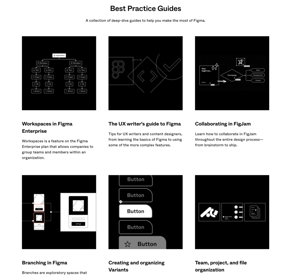
- Onboarding Process: Figma provides a robust onboarding experience with tutorials, community forums, and detailed documentation.
In the Canva vs Figma comparison for ease of use, Canva stands out as the more beginner-friendly platform, making it ideal for users who desire quick results without a steep learning curve. Figma, on the other hand, while offering a more comprehensive suite of tools, has made commendable efforts in making its platform accessible, but it might require a tad more time to master fully.
4. Features and Functionality: Canva vs Figma
When analyzing Canva vs Figma in terms of features and functionality, a clear distinction emerges. Canva caters more towards those seeking quick, user-friendly designs bolstered by a rich template environment. On the other hand, Figma is tailored for professionals desiring detailed design capabilities, especially with features like real-time collaboration and prototyping. With this foundational understanding, let’s delve deeper into the respective offerings of these two platforms.
Canva:
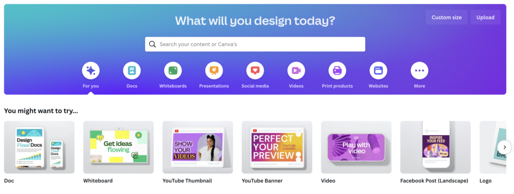
- Templates: Canva is renowned for its vast array of ready-to-use templates, covering everything from social media posts to business presentations.
- Drag-and-Drop Interface: Its intuitive feature ensures users, even without a design background, can craft professional-looking designs with ease.
- Stock Library: An impressive collection of photos, graphics, and icons within Canva meets a wide range of design needs.
- Animations and GIFs: Canva’s tools enable users to create animated content suitable for various digital platforms.
- Print and Publishing Options: A convenient feature for users to directly order prints or distribute their designs on numerous online platforms.
Figma:
- Vector Editing: Precision is at the forefront with Figma’s vector editing tools, ideal for complex designs.
- Real-time Collaboration: This standout feature enables teams to simultaneously work on designs, witnessing live updates and fostering enhanced cooperation.
- Prototyping: A key selling point for Figma, allowing for the creation of interactive prototypes, indispensable for app or website design.
- Design Components: With these reusable elements, consistency is maintained across projects, and designers can save considerable time.
- Plugin Ecosystem: Enhancing Figma’s core capabilities and facilitating integrations is made easy with its diverse range of plugins.


In summary, both Canva and Figma stand out as robust design platforms, each with a unique appeal to different user segments. The debate of Canva vs Figma transcends mere feature comparison; it’s about aligning with the specific design aspirations and needs of users. Whether you’re a design veteran or a novice venturing into the creative domain, recognizing the features at your fingertips can significantly impact your design journey’s trajectory.
5. Design Capabilities: Canva vs Figma
In today’s digital landscape, the right tool can significantly amplify your output. We’re not just talking about design tools like Canva vs Figma but also video editing platforms; for instance, our comprehensive comparison of InVideo vs Pictory delves into this domain. Whether you’re diving into graphic design or video editing, these comparative insights can guide your choice towards the most fitting tool.
In this post, we zero in on the world of online design. Canva, with its user-centric design philosophy, is perfect for those needing swift, polished outputs. Figma, on the other hand, stands out for its nuanced, professional-grade features, catering to detailed design pursuits. As we journey further, consider which platform aligns more seamlessly with your design goals.
Canva:
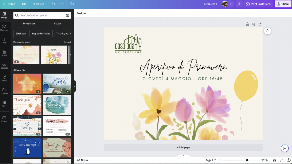
- Template Variety: Canva shines with its extensive library of design templates, catering to everything from presentations and infographics to social media graphics.
- Customization: Beyond templates, Canva allows users to tweak and tailor elements, making it simple to adapt a design to one’s brand or style.
- Color Palette Tools: Canva’s color tools enable users to maintain brand consistency and experiment with various color schemes effortlessly.
- Font Library: Users can access a vast range of fonts or even upload their own, allowing for greater design flexibility.
- Interactive Elements: Canva recently introduced interactive elements, such as quizzes and polls, broadening its design capabilities.
Figma:
- Precision Tools: Figma is equipped with advanced vector editing tools, enabling design professionals to craft intricate designs with minute detail.
- Frame Innovations: Its unique approach to frames, rather than traditional artboards, provides a fresh perspective on layout design.
- Dynamic Overlays: Designers can create interactive overlays without duplicating frames, streamlining the prototyping process.
- Smart Animation: Figma’s prototyping tools come with animation capabilities, allowing users to simulate real-world app or website interactions.
- Component System: This feature promotes design consistency, as reusable components can be utilized across different projects.

6. Collaboration and Teamwork: Canva vs Figma
In an era where teamwork often transcends physical boundaries, the collaboration capabilities of design tools are paramount. The Canva vs Figma debate in this context zeroes in on how these platforms empower teams, streamline workflows, and foster real-time collaboration. Here’s an exploration into how each tool accommodates teamwork and collaborative design:
Canva:
- Shared Folders: Canva enables users to create folders where multiple team members can access and edit designs, centralizing assets and ensuring consistency.
- Real-time Comments: Team members can provide feedback directly on a design, enhancing the review and revision process.
- Team Templates: Brands and businesses can create templates that align with their branding, ensuring cohesive designs across all team-generated content.
- Role-Based Access: Admins can set different access levels, determining who can edit, view, or comment on specific designs.
- Brand Kit: Centralizes brand assets like logos, colors, and fonts, ensuring team-wide consistency.

Figma:
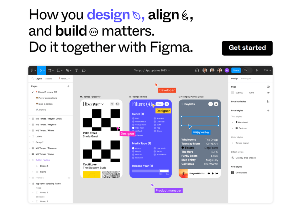
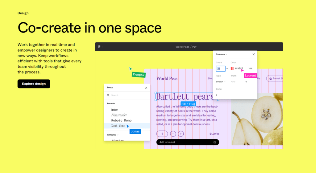
- Simultaneous Editing: Perhaps Figma’s most notable feature, multiple designers can work on the same project concurrently, visualizing real-time changes.
- Version History: Teams can track design iterations, revert to previous versions, or understand the evolution of a project over time.
- Interactive Comments: Comments can be linked to specific design elements, making feedback more contextual and actionable.
- User Permissions: Like Canva, Figma allows for detailed permission settings, ensuring that design assets are accessed and edited appropriately.
- Team Libraries: Centralized components, styles, and assets streamline design consistency across projects and team members.
Diving into the Canva vs Figma discourse on collaboration and teamwork, it’s evident that while Canva offers a robust, intuitive collaborative space, especially suited for content-driven teams, Figma brings a level of real-time teamwork capabilities tailored more for intricate, professional design projects.
To encapsulate, both Canva and Figma have made strides in fostering a collaborative design environment. The deciding factor hinges on the nature of your projects, the size and dynamics of your team, and the granularity of collaboration you require. The right tool seamlessly integrates into your team’s workflow, bridging gaps and elevating collective creativity.
7. Export and Integration Options: Canva vs Figma
In the realm of design, the ability to efficiently export creations and integrate with other tools can significantly influence a designer’s workflow. As we dive into the Canva vs Figma comparison regarding export and integration capabilities, it’s imperative to grasp how each platform facilitates a seamless transition between different stages of a project.
Canva:
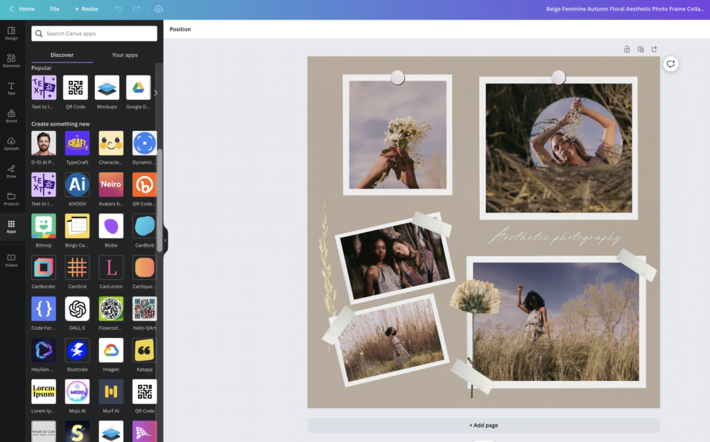
- Diverse Export Formats: Canva supports a wide range of formats, including JPG, PNG, PDF, GIF, and even MP4 for video-based designs.
- Direct Social Media Posting: With Canva’s integrated sharing options, users can instantly post their designs to various social media platforms.
- Print Services: Unique to Canva is the option to directly order prints of your designs, from business cards to posters.
- Integration with Stock Libraries: Direct access to stock photos and elements without leaving the Canva platform enhances the design process.
- Cloud Storage Integration: Canva allows easy connection with storage solutions like Google Drive and Dropbox for streamlined asset management.
Figma:
- Vector Exports: Figma emphasizes its vector-based design, supporting exports in SVG, PNG, and JPG formats.
- Developer Handoff: With Figma’s built-in code panel, designers can seamlessly hand off assets to developers, complete with CSS, iOS, or Android code.
- Third-party Plugin Support: Figma’s open API has fostered a robust ecosystem of plugins that enhance functionality and integration with other tools.
- Embedding Options: Users can embed Figma designs directly into other platforms like Notion, enhancing collaborative reviews.
- Integration with Prototyping Tools: Figma easily integrates with tools like Zeplin and Principle, further streamlining the design-to-development process.
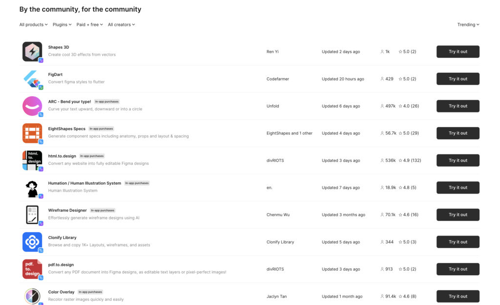
Within the Canva vs Figma dialogue about export and integration options, Canva offers a suite of options tailored more for content creators and marketers, emphasizing ease and direct utility. In contrast, Figma shines in its capabilities that cater to design and development workflows, ensuring smooth transitions between design, review, and execution stages.
Summing up, your choice between Canva and Figma for export and integration depends on the end goal of your projects. If direct sharing, printing, and diverse format exports are crucial, Canva might be your go-to. For those deeply entrenched in design-to-development processes and seeking intricate integrations, Figma stands out as a formidable contender.
8. Customer Support and Resources
Support and educational resources can significantly influence the user experience of a platform, especially when it comes to complex design tools. In our continued exploration of Canva vs Figma, let’s now delve into the kind of support and resources each platform provides its users.
Canva:
- Help Center: Canva boasts a comprehensive Help Center with articles, FAQs, and troubleshooting guides addressing a broad spectrum of topics.
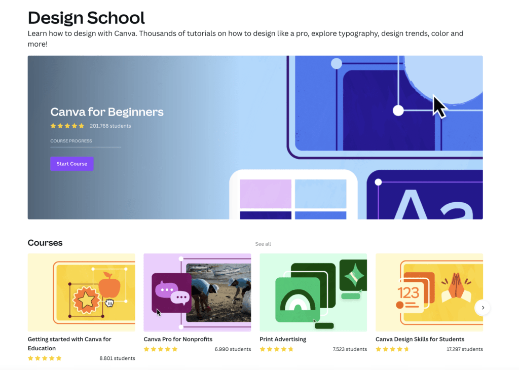
- Design School: An added boon for users is Canva’s Design School, offering free tutorials, courses, and workshops that cover both basic and advanced design techniques.
- Community Forums: A space where users can engage in discussions, share feedback, and learn from peers’ experiences.
- Email and Chat Support: Dedicated support channels allow users to get timely assistance for more intricate issues or queries.
Figma:
- Help Center: Figma’s Help Center is an organized repository of articles, guides, and FAQs tailored to assist both novice and advanced users.
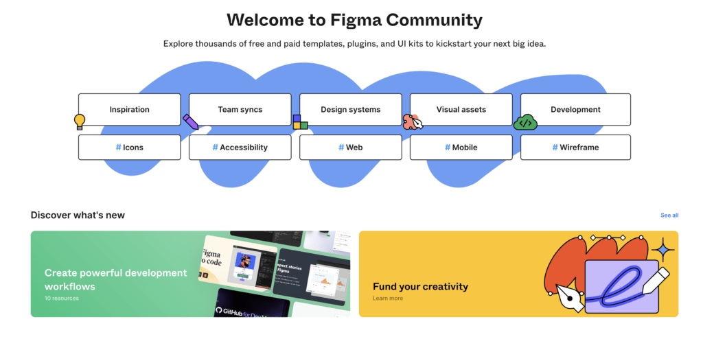
- Figma Community: This unique space allows designers to share their creations, learn from others, and access user-created plugins and assets.
- Interactive Tutorials: Figma provides in-app interactive tutorials, enabling users to learn by doing, which is particularly beneficial for those new to the platform.
- User Forum: A vibrant space for discussions, troubleshooting, and sharing best practices, ensuring users make the most out of Figma.
- Support Tickets: Users can raise support tickets for pressing issues, ensuring a structured approach to problem resolution.
In the Canva vs Figma conversation around customer support and resources, both platforms show a commendable commitment to user empowerment and support. Canva, with its Design School, is perfect for those looking to expand their design acumen. Figma, on the other hand, offers a blend of structured support and community-driven learning, catering particularly well to professional designers and teams.
In conclusion, the choice between Canva and Figma in terms of support largely depends on your learning style and the depth of assistance you anticipate needing. Both platforms prioritize user education and troubleshooting, ensuring a smooth, enriched design journey.
9. Pros and Cons: Canva vs Figma
Diving deeper into the Canva vs Figma comparison, an understanding of the strengths and limitations of each tool can provide clarity to potential users. This section will highlight the pros and cons of both platforms, offering a succinct overview to guide your choice.
Canva:
Pros
- User-friendly interface suitable for beginners.
- Diverse array of pre-designed templates.
- Streamlined content creation with direct posting options.
- Integrated stock library for media assets.
- Affordable with a rich free version and value-for-money premium options.
Cons
- Limited advanced design features.
- Less customization flexibility within templates.
- Web-based; offline work is challenging.
Figma:
Pros
- Robust tools tailored for professional use.
- Real-time design collaboration with multiple users.
- Browser-based, making it accessible across different operating systems.
- Dynamic integration of a wide range of third-party plugins.
- Integrated environment for both design and prototyping.
Cons
- Steeper learning curve for beginners.
- Potential performance lags with intricate designs.
- Real-time collaboration requires an internet connection.
10. Conclusion: Canva vs Figma
As we reach the culmination of our Canva vs Figma deep dive, it’s evident that both tools bring a distinct set of advantages to the design table. While Canva caters predominantly to individuals and businesses looking for swift, hassle-free design solutions, Figma emerges as a robust platform for professionals and teams desiring advanced capabilities and collaboration features.
Choosing between Canva and Figma ultimately boils down to your specific needs, skill level, and design objectives. If you’re a marketer, entrepreneur, or someone who needs to create visually appealing content without the intricacies of professional design, Canva is your go-to. Its intuitive interface, coupled with a plethora of templates and design assets, makes the design process a breeze.
Conversely, if you’re a seasoned designer, part of a design team, or someone who thrives on detailed, collaborative design work, Figma’s comprehensive toolkit and real-time collaboration are hard to beat.
In the grand Canva vs Figma debate, there’s no clear winner. Both platforms have carved their niche in the design world, and their prominence is a testament to their efficacy. Instead of seeking a definitive answer, evaluate what you want from a design tool, and let your requirements guide your choice.
Remember, the best tool is the one that fits seamlessly into your workflow and allows you to bring your creative visions to life with ease and efficiency. Whether you lean towards Canva or Figma, harness their features to the fullest, and let your designs do the talking.


